With over 1 billion people actively using Instagram every month, it’s hard not to see why the platform is perfect for capturing life’s greatest joys. We love to browse the #PartyLite and #MyStyle hashtags to see what you get up to with your PartyLite products, but we understand that getting started in the world of interior photography may be overwhelming.
Whether you’re starting out on an interior Instagram journey or simply want to learn the tricks of the trade for taking the best home décor shots, we’ve enlisted the help of some of our favorite interior content creators on Instagram to bring you our definitive Instagram photography guide. And as an exclusive bonus, we asked Kira Worrall, a professional photographic stylist who’s worked on a host of PartyLite’s own catalogs, to give her insider secrets too! For those tricky shots where you can’t quite get the angle right or you’re not entirely sure how to achieve the best lighting, we’ve collected our best tips for creating beautiful Instagram photography to bring your feed to life.
#1. Lighting
You don’t need fancy, expensive lighting equipment to achieve professional results. Save your coins and instead of ring lights and box lights, open your curtains! Natural daylight is the most flattering light for photography and will give your shots a luminescent glow that your favorite filter can’t compete with.
Natural lighting is free, reliable and creates a airy, romantic feel to your photographs. While midday light is great for a neutral effect and opening up the space in your shot, experimenting with natural lighting at various times of the day is excellent for discovering what different effects you can achieve.

A great photography tip we’ll let you in on, is the golden hour. The golden hour occurs twice a day and is the time just after sunrise or just before sunset when the sun is closest to the horizon. This angle of the sun bathes us in a golden light, transforming your photography and giving it a warming, magical effect.
Nicola Capper, the photographer behind @nordicnotesblog, is also a big fan of natural light and gives us her best advice on how to get the most out of it,
“Take your photos in natural daylight, this will transform them more than any filter can. Even if its a cloudy day, open the curtains, clear the windowsill and let the shadows help you to add atmosphere and hygge to the story you're telling through each of those little squares.”
Sometimes natural lighting may be harder to capture. If your home doesn’t get to see much daylight or if you live in a particularly overcast area, don’t despair. Emma Diaz, the creator of @thelittlestonecottage, tells us how to adapt to the light and use it to your advantage,
“I love working with the shadows in my cottage. If you have a bright house then great, but don't try and over brighten or over expose your images as you will lose the quality. If you embrace the light (or lack of it!) and work with it, you will create an image that is unique to you and your home!”

You can find Emma at @thelittlestonecottage.
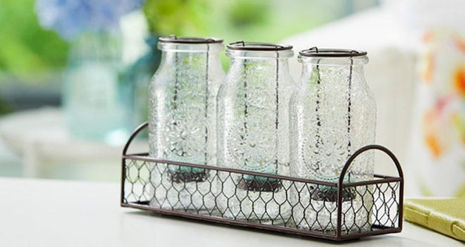
Get this look with our range of Hurricane Candle Holders - perfect for filling with your choice of decorative items in the day, and pairing with tealight candles in the evening.
When working with PartyLite’s products, stylist Kira knows just how lighting can make the difference to showcasing your subject matter,
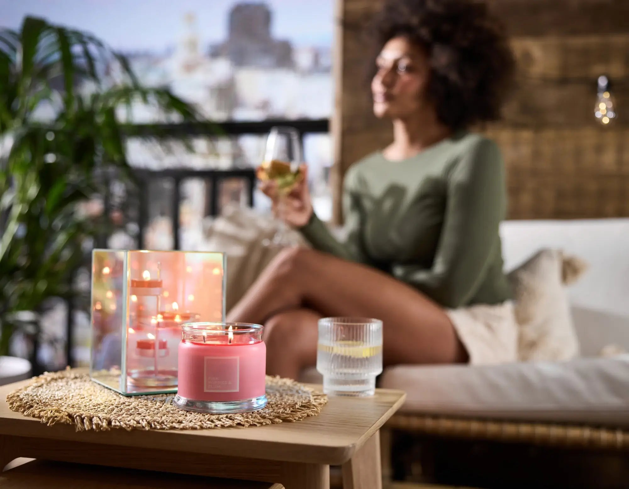
“Some PartyLite products have iridescence or super shiny finishes so it’s always important to make sure the light is hitting the product just right to really show off these attributes. But some products might be better in the dark to showcase a glow! Don’t forget to personalise the lighting to each shot.”
#2. Styling
So you’ve got your lighting, but how do you style your shot? Kira loves to style products on the right background to make it the star, especially for pieces that have a lot of detail.
“Shooting products on basic, clean or even white backgrounds really make the product stand out and ensures it’s the main focus”
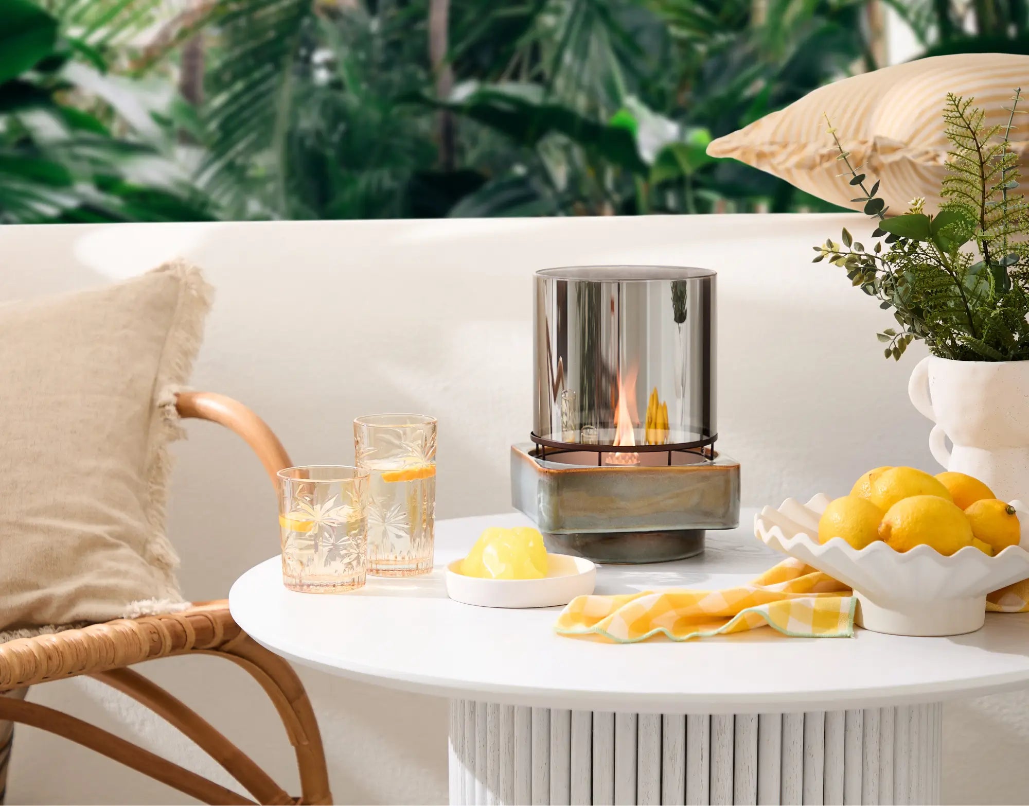
While you want your focal point to stand out, adding something else to the frame might be right for some products, helping add your point of view against a well-selected background.

Kira added,
“When taking pictures with a Lifestyle feel, have the odd book, magazine or cup of tea laying about in the background. This makes your pictures look realistic and believable - little homely touches here and there adds interest and connects with the viewer.”
Try playing around with different props. We love how Rachel, @rach_southern, uses flowers and foliage to brighten up her shots.
“If you've spotted a shelf or a sill looking slightly bare, greenery is the way to go. Pop a plant - real or fake - or a small vase of flowers on it, and your photos will instantly look more lush and homely.”
The best way to get to grips with styling is to experiment. Through trial and error you’ll start to get a sense of what works and what doesn’t, or what you do and don’t like. Get creative with shapes, angles, placement and your background to discover how to elevate your photo.
Harriet, @mindfulnessbydesign, has given us her best tips on how to style for maximum impact,
“Make your images feel as natural as possible by using a mixture of textures and layering accessories to create depth and visual intrigue. Simple touches such as leaning pictures against a wall, draping a throw or stacking magazines can all help to tell the story.“

You can find Harriet at @mindfulnessbydesign.
Explore new textures today by browsing our home styling accessories, crafted from a range of stunning materials for a unique finish.
#3. Composition
Once you’ve found your styling staples, you’ve then got to figure out how you want to arrange them for maximum impact. There are hundreds of ways you can compose your shot, but it’s really up to you how you want it to look and what message you want to convey. Kira believes it’s all about try and try again,
“Finding the right angle that suits the subject and shows each element in the best way can take trial and error for the pros too. Experiment and try a variety of angles, you might be surprised to find something works to show off the product that you didn’t expect.”

A popular technique to consider is the rule of thirds. If you imagine that your camera lense has been split into 9 equal rectangles with horizontal and vertical lines, there will be 4 points where these lines overlap. It’s advised to place your main focal features over any of these 4 points of contact for a well balanced image.
We spoke to Carrie of www.carriecottondesign.com about her go-to composition style,
“Vignettes are popular on Instagram as they provide a small glimpse into a look or style without invading your privacy too much. I think wide angle shots can end up lacking a clear focal point and look a bit like a photo for a real estate brochure. Honing in on smaller areas allows your eye to focus on one thing and really appreciate it. Plus it allows you, as the photographer, to focus all your efforts on styling one area at a time. A console table with art above it, shelving (shelfies are huge on Insta right now) or a bit of your bed with a nightstand and lamp or flowers.”
#4. Editing
The process doesn’t end at taking the photos - much of the magic happens in the editing stage. While Instagram has a great choice of filters and basic editing software, there are a whole host of photo editing apps on the market to help you enhance your images. Forget Photoshop, your mobile phone can be your greatest tool for producing high quality, beautiful imagery.
Adjusting the brightness, exposure, contrast and even cropping your images can totally change the look and feel of them. Uncertain about how an image looks? Add a filter over the top. The lighting in your home being unforgiving? Increase the brightness. If you’re new to photography and are not one hundred percent confident with your images, editing them can really transform and elevate your shots.

#5. Theme
Our final pointer for capturing excellent Instagram photography, is to always bear your theme in mind. There’s nothing more satisfying than a color cohesive feed! Whether you select a specific color or style, make sure it’s achievable as you’ll be shooting a lot of it. Your color scheme can be applied through your background, props, focal pieces or even in the editing process by layering a colored lense or filter over the top.
Compositional style and content also plays a big part in the overall look of your theme, so be sure to pick something that’s realistic for you. And remember, your theme is the first thing people will see when they click on your profile so give them the best first impression. Consider your theme your virtual personality, a way for others to get a sense of your content.
We asked Jade, from The Little Bees and Me, for advice on how she maintains a beautifully themed feed,
“I am a neutrals girl, but can get distracted by all of the amazing home accounts that I follow on Instagram. I’ve been known to see something look amazing in someone else’s home, buy it on a whim only to get it home and realize it doesn’t fit in at all. I have a color palette saved on my phone to remind myself of what not to buy when I’m shopping. Luckily I’m always usually drawn to neutral colors and textures, but if a neon pink cushion ever catches my eye the palette is there to remind me I’ll probably be returning it the next day!”
Follow our Instagram account, @PartyLiteNA, for more photography inspiration and home styling ideas to bring your feed to life.


